Research
Conceptualisation
Design
Developer handoff
Development Team
Graphic Designer
1 month
CONTEXT
The Women's Leadership Circle (WLC), a prestigious network of C-suite women mentors, approached us to refresh their digital presence. The primary objective was to create a modern, executive-caliber website that would effectively showcase their members, highlight events, and attract potential C-suite women leaders to join their community.
But what is WLC?
WLC serves as a vital ecosystem that bridges the leadership gap for women in entrepreneurial and corporate roles. The organization provides comprehensive support through mentorship opportunities, professional growth initiatives, and a powerful network of like-minded women leaders.
PROBLEM BREAKDOWN
Working within specific client constraints, we needed to optimize both budget and timeline. The solution involved leveraging pre-existing templates from Theme Forest, allowing us to focus on customization rather than building from scratch. While template-based development suited most pages, the Home Page and Members Page required custom coding to achieve their specific functionality needs. This hybrid approach helped us balance resource optimization with customized features where they mattered most. The key deliverables were:
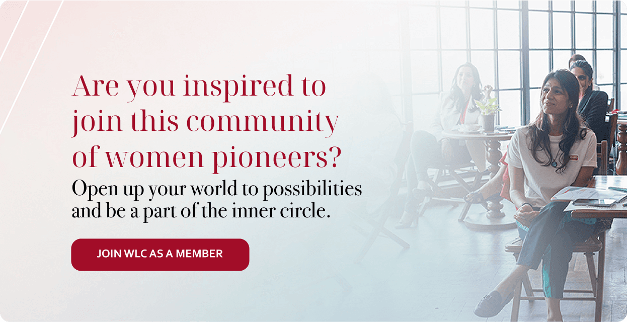
Brand Credibility
Create a compelling website presence that would convince potential C-suite women to join the platform.
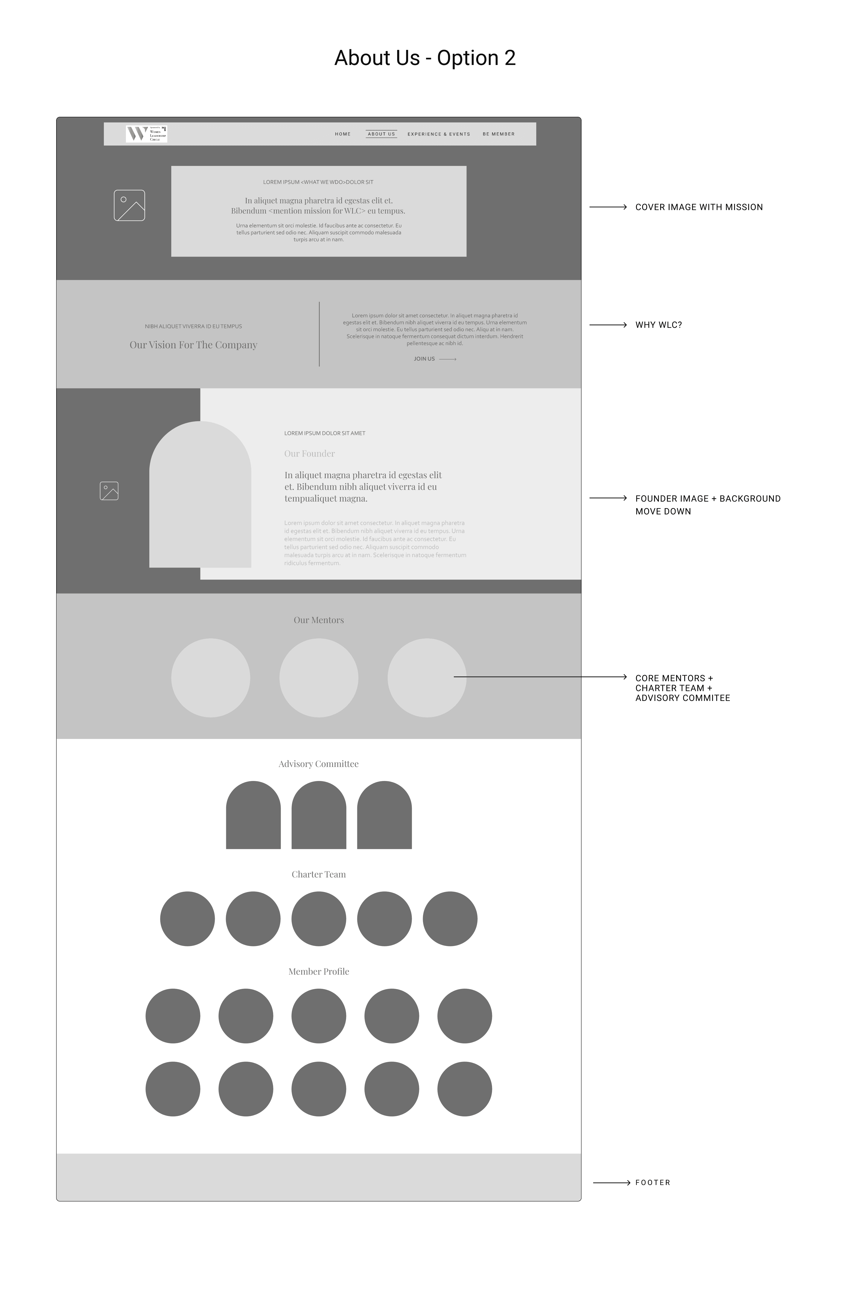
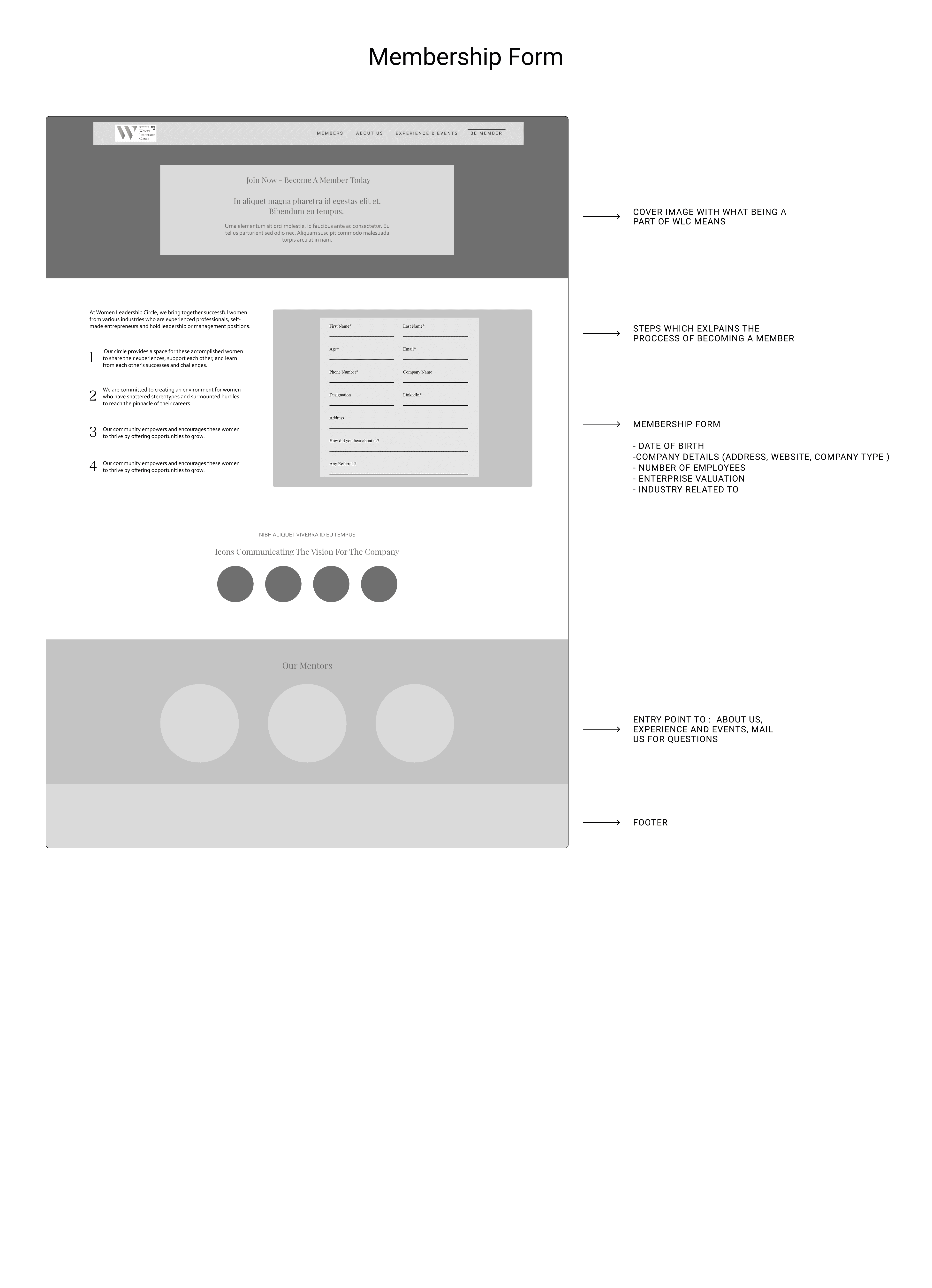
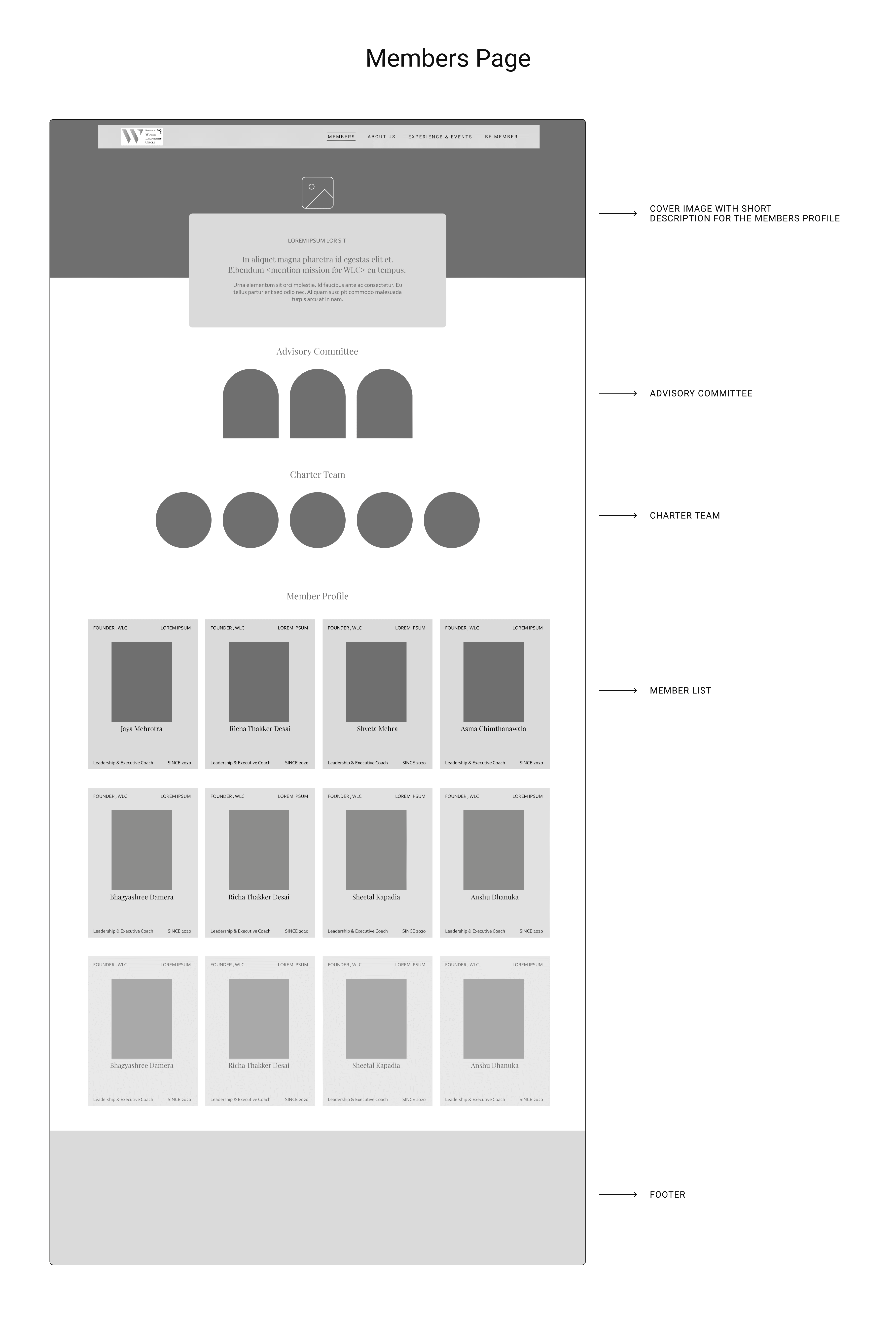
Member Profile
To showcase the professionals while making their information accessible and engaging for potential members.
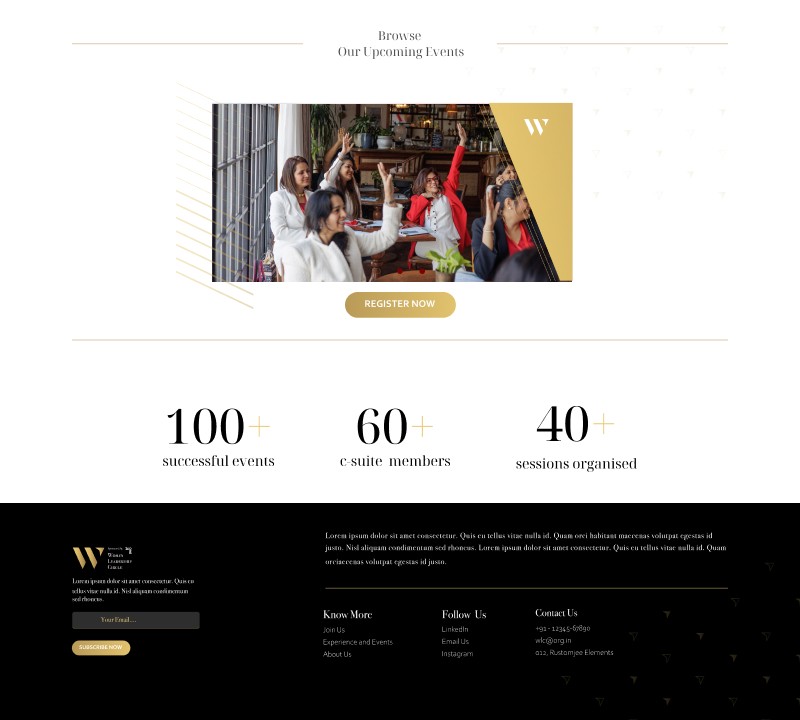
Event Directory
The idea is to show the value of WLC's exclusive gatherings, provide information for upcoming events, and demonstrate the active nature of the community.
GETTING STARTED
With the brand open to design direction, we took the initiative to structure an intuitive website flow. We mapped the key user journeys and organized sections to create a cohesive navigation path that would serve both members and potential recruits.
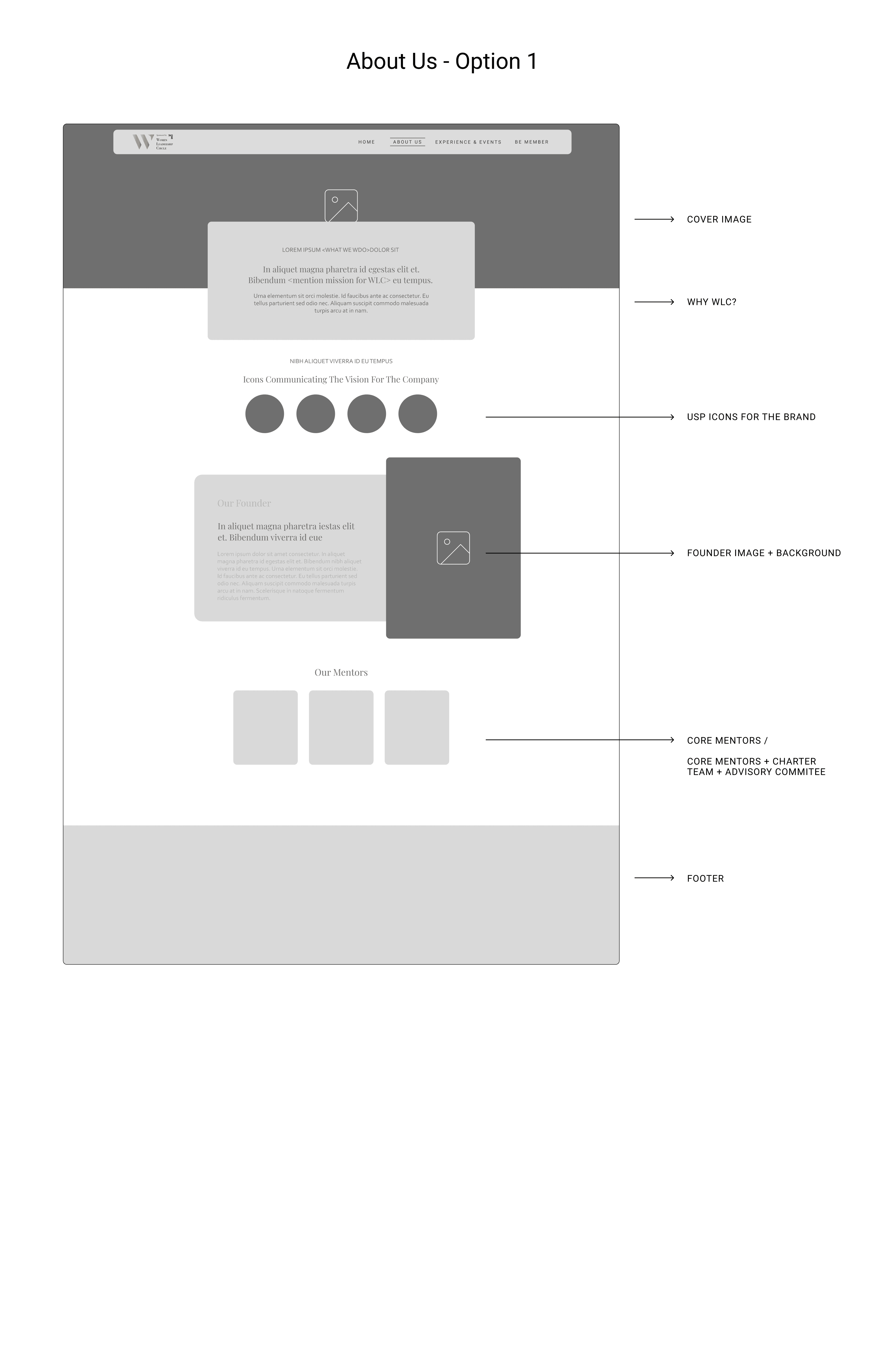

FIGURING OUT THE UI
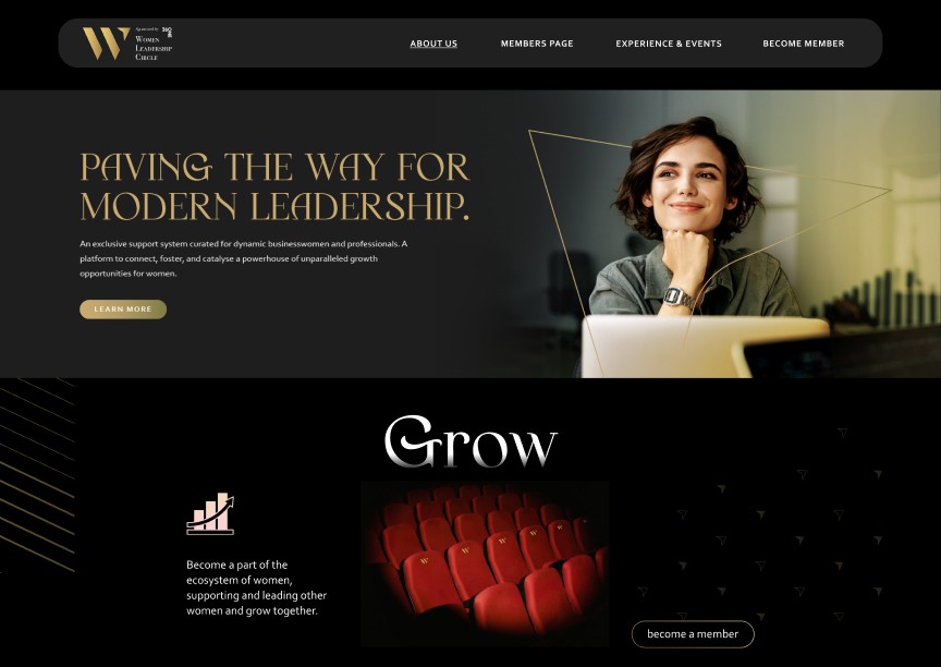
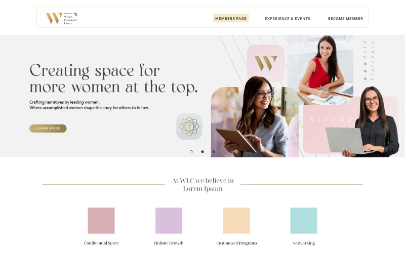
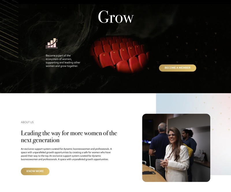
After getting clarity on the content blocks, we proceeded to create the hi-fi version for the homepage. The brand was inclined to use gold from their logo along with red and black to exude the feeling of elite and exclusiveness. To understand their approach, we created different options to see which color scheme they preferred.


GOING FORTH
he client saw potential in both the dark and light versions, finding different elements appealing in each. They suggested combining the two approaches, creating a mix of dark and light sections on the page. To harmonize these contrasting themes, we proposed adding complementary colors that would help unite the visual elements. The following were approved.

EVOLVING THE COLOR STORY
By expanding the color palette, we found a way to give the website a more cohesive appearance while lightening up the overall visual tone. The introduction of softer colors helped bridge the dark and light elements, creating a more balanced design approach. We continued iterating with new options to find the right balance.


REACHING VISUAL CONSENSUS
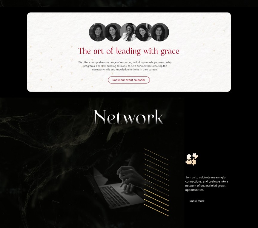
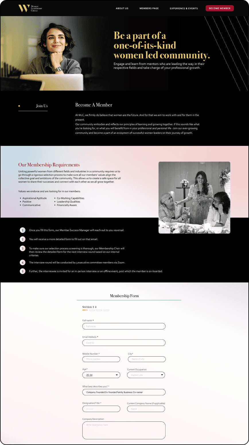
Elements were handpicked from the new visuals and after few feedback sessions, the final screens for the home page was developed.

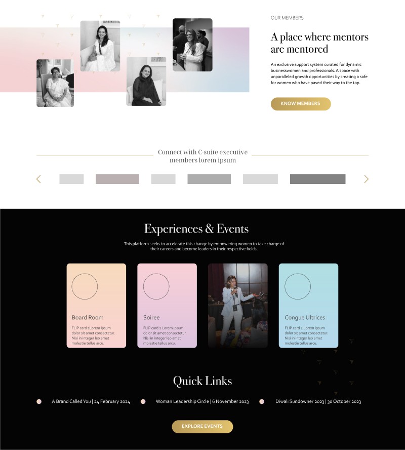
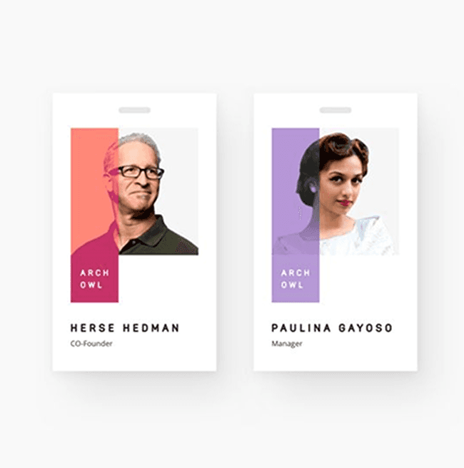
MEMBER CARDS DESIGN
We started with researching profile card designs for member showcases. We started with research and competitive analysis to understand effective ways to showcase professional profiles. Through iterative design, we developed several options focusing on a simple yet impactful presentation. Each card needed to provide a quick introduction while allowing users to access detailed member information with a single click. The key challenge was presenting both professional designations and organizational roles effectively.
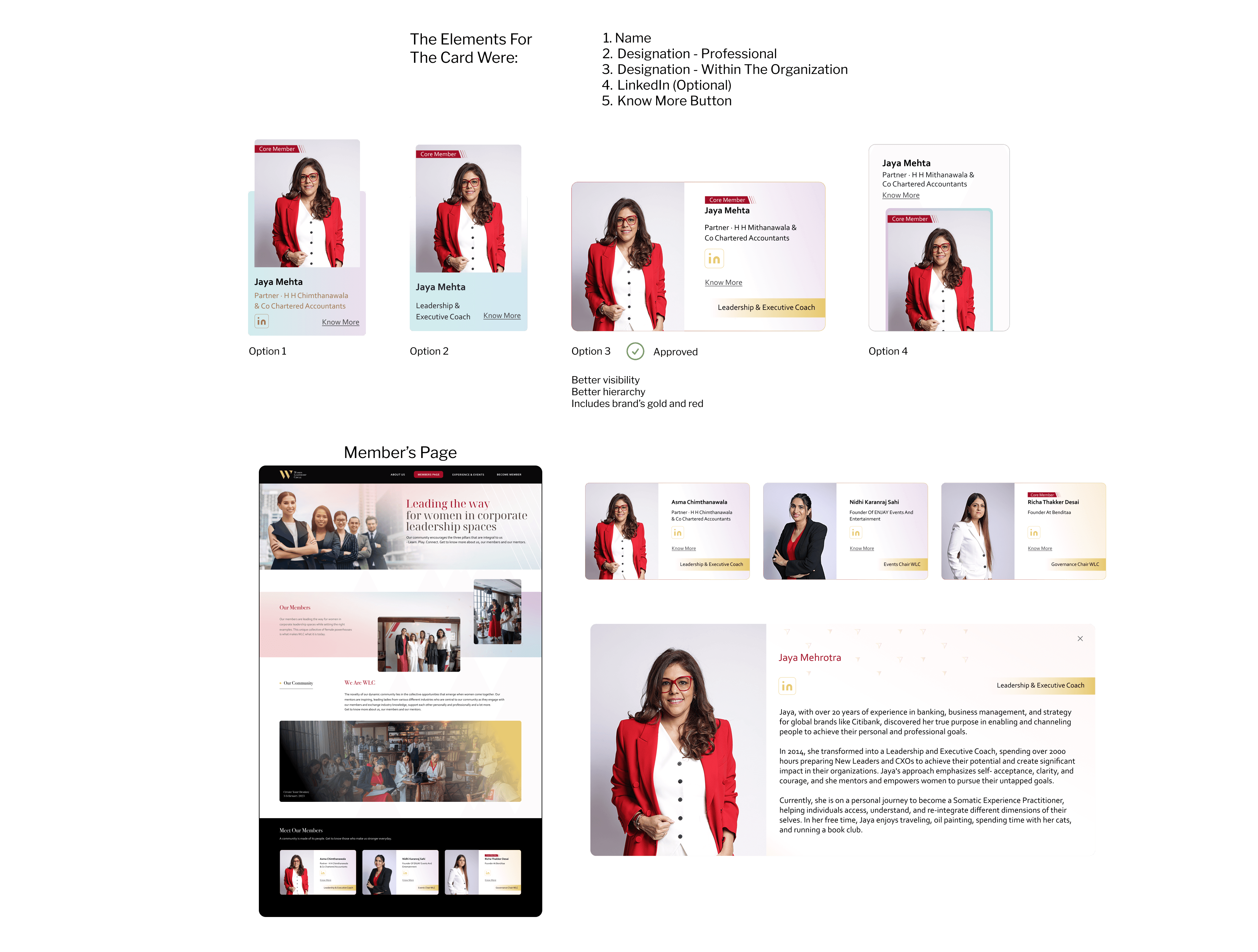
FINAL SCREENS
The final screens were a mix of dark and light conent boxes with hues of soft color palette present across sections/ content blocks.


LOOKING AHEAD
Project Learnings
Without an initial visual guideline, defining the brand's identity was challenging. However, our collaboration helped establish a clear direction and refined the process.
This project took a unique approach by focusing on members as the core element, rather than prioritizing the e-commerce aspect. It was fascinating to create a design strategy that highlighted the brand first, setting it apart from conventional product-centric designs.
Working with WordPress revealed its strengths and limitations compared to platforms like Shopify. This knowledge will help guide future project decisions based on client needs and goals.