
Research
Stakeholder Interview
Consumer Survey
Conceptualisation
Website Design
Design manager
Team of Developers
Visual Designer
5 months
CONTEXT
Love Depot recognized the need for a comprehensive website redesign after years of incremental updates that, while keeping the site functional, had resulted in a fragmented digital experience. The existing platform, though regularly maintained with small feature additions, lacked a cohesive visual language and intuitive user flow.
But what is Love Depot?
Love Depot is India's premier sexual wellness marketplace, offering a curated collection of intimate products and accessories. As a pioneering brand in the wellness space, they focus on creating an inclusive shopping experience that prioritizes sexual health and personal wellbeing.
QUANTITATIVE ANALYSIS
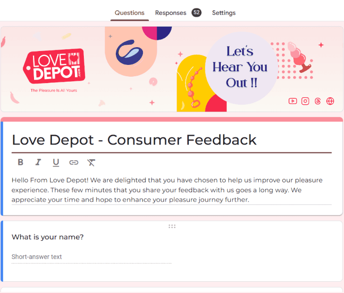
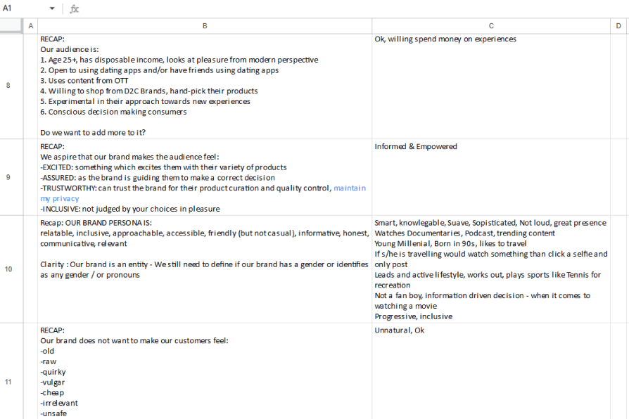
To refine our results we did a survey over 50+ customers to understand their shopping preferences, approach and pain points. We also held a 4-hour workshop with key stakeholders to deep dive into the brand's goals and personality. The main points which needed to be addressed were:

PROBLEM BREAKDOWN
The client sought to develop a custom-coded Shopify website that would facilitate seamless product discovery, establish a unified brand aesthetic, and rebuild customer trust through a more intentional and strategic design approach.
The culmination of the quantitative research and problem analysis revealed key areas for improvement to better serve the brand's customers and business objectives. The core goals of the website redesign project were to:
Mobile First
Approach
Google Analytics results showed that 80% of website users were making purchases via mobile. It was key to optimize the website for mobile use cases.
Improved Website
Architecture
The website architecture had become fragmented as new functionality and sections were added, making the navigation and information architecture unclear.
Improving Product
Usage Information
Customers wanted clearer, more comprehensive product usage instructions to support their purchasing decisions.
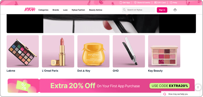
UNDERSTANDING THE MARKET
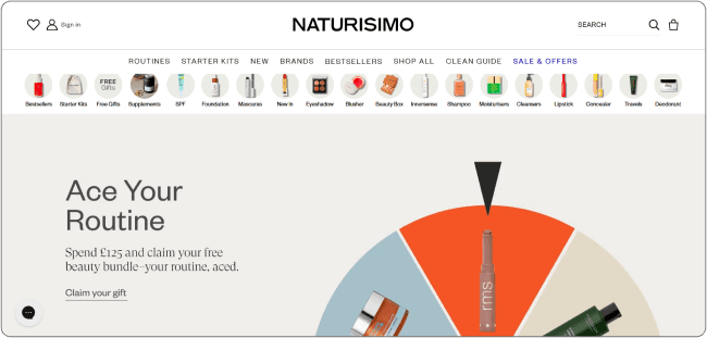
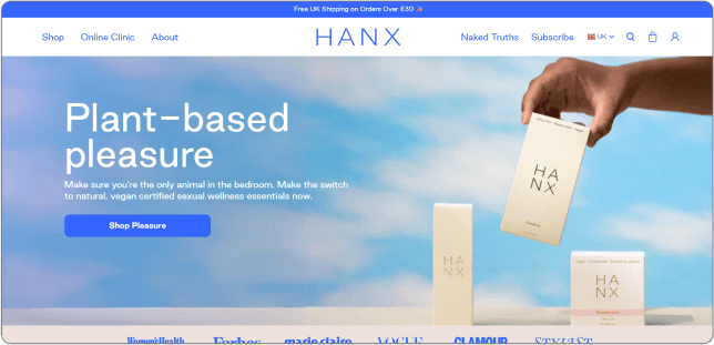
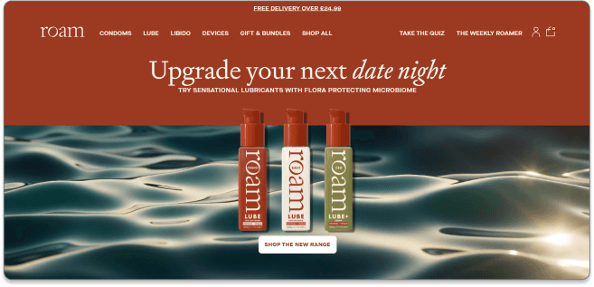
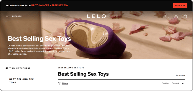
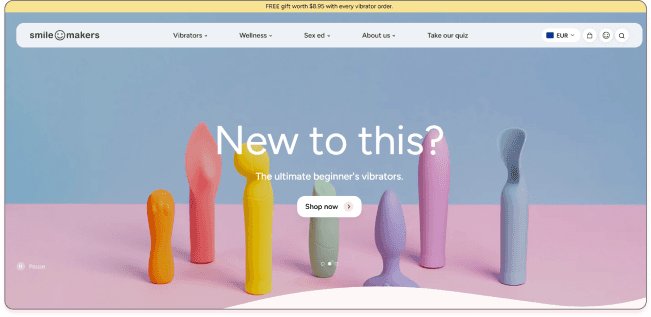
I studied competitor brands like Roam, Lelo, Smile Makers etc to understand how they talk about their product and their categories. Since this website was a marketplace and was not catering to products of just from one brand, the next step was to research other websites like Naturismo, Nykaa, etc.
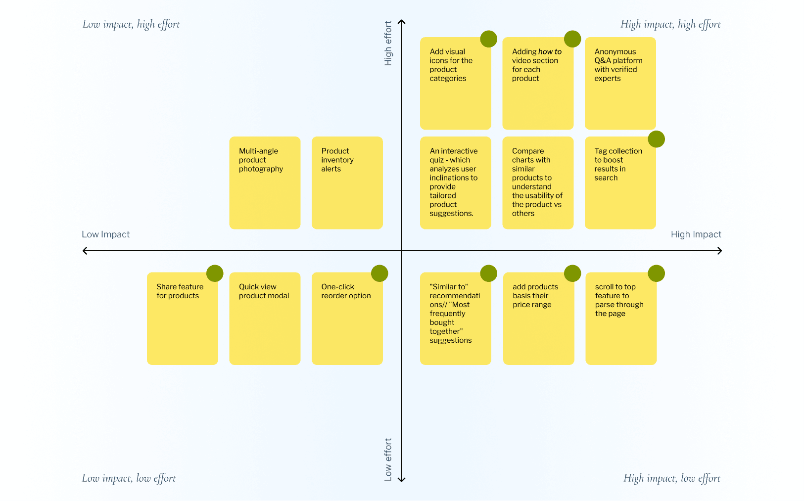
THE NEXT STEPS
After all the research and possible solutions, we plotted and segregated the updates/additions into four categories. The ones marked with green were taken ahead.
LET'S BEGIN!
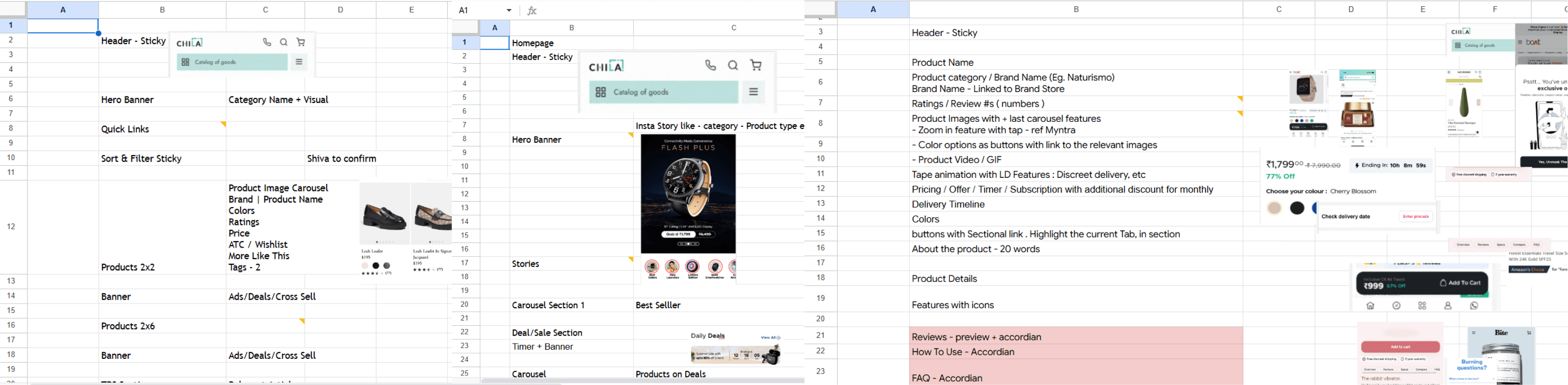
Before diving into design, we collaborated with stakeholders and developers to document all required assets, sections, and functionalities for each page. This systematic approach helped understand technical limitations and align expectations. As the platform needed to balance marketplace functionality with educational content for multiple brands, we opted for carefully curated sections rather than a template-based approach.
DESIGN PROCESS
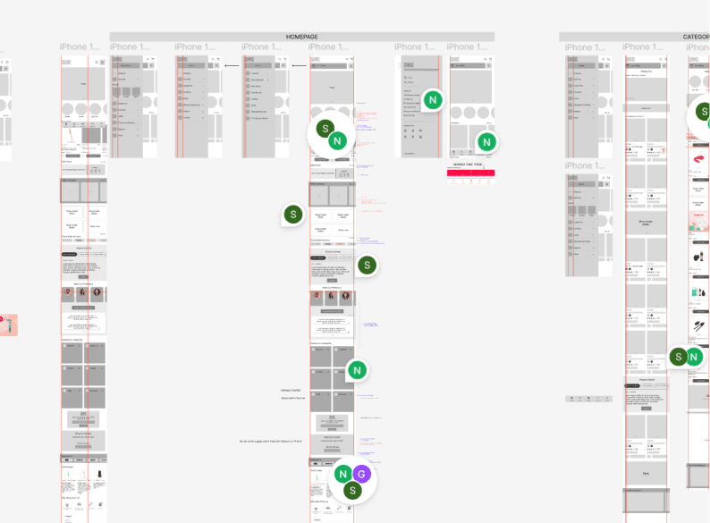
The medium fidelity wireframing phase was the most time-intensive yet crucial stage of our design process. This phase demanded extensive collaboration with the brand manager and development team as we worked to establish the foundational structure of the website. Following a mobile-first approach, we designed and optimized the mobile experience before scaling to desktop versions.

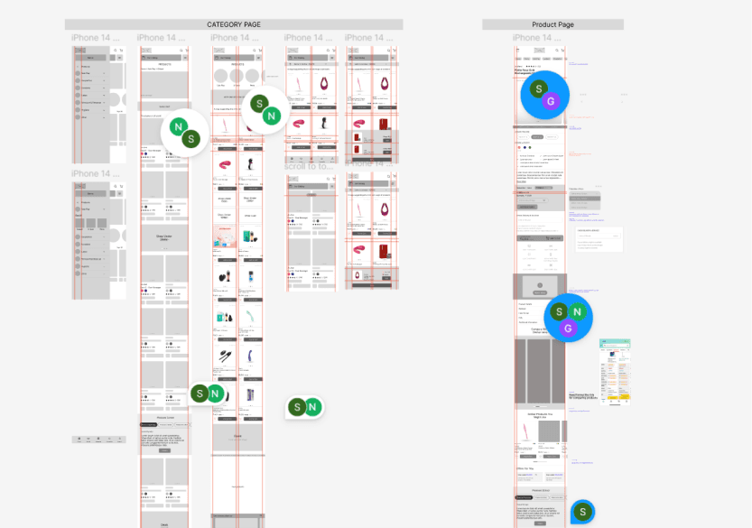

FINAL SCREENS
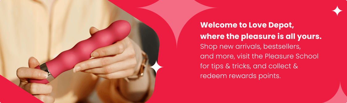
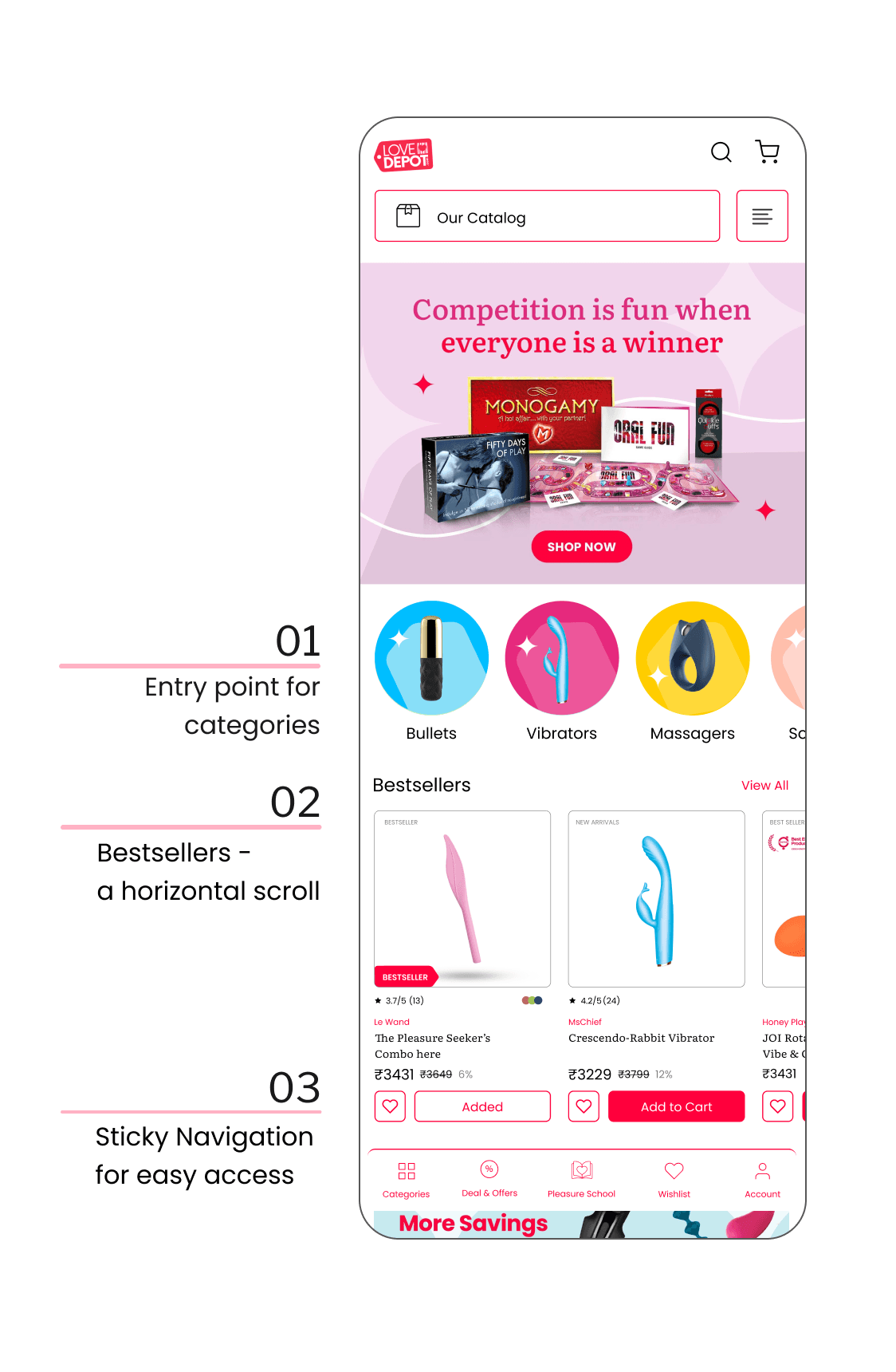
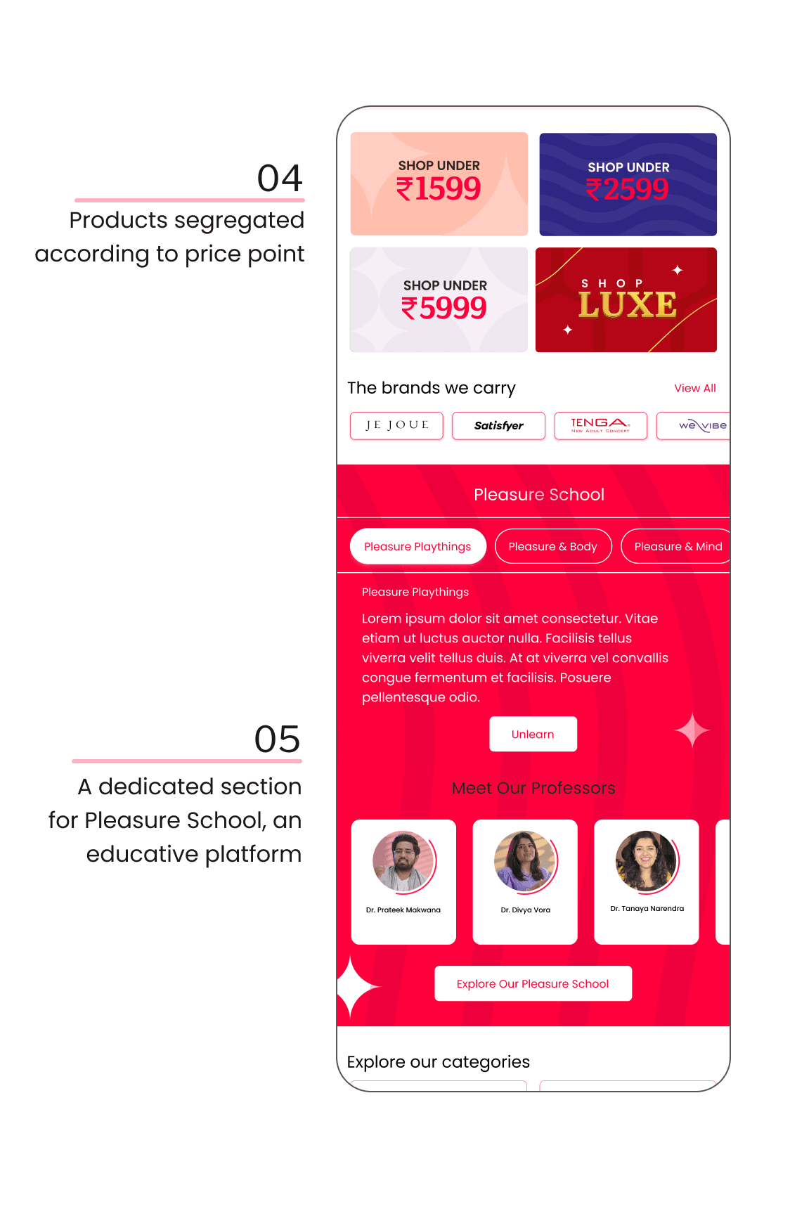
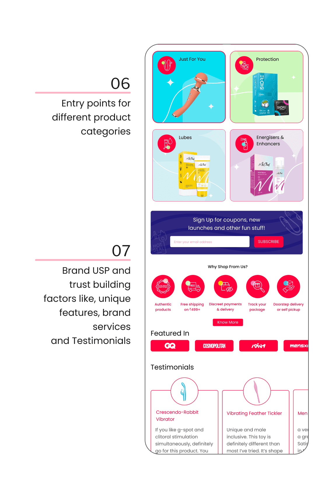
The Home Page followed the principal of creating a brand trustworthy and giving options catering to everyone’s needs. The flow made sure the user has options clear marked categories and options according to their price range.
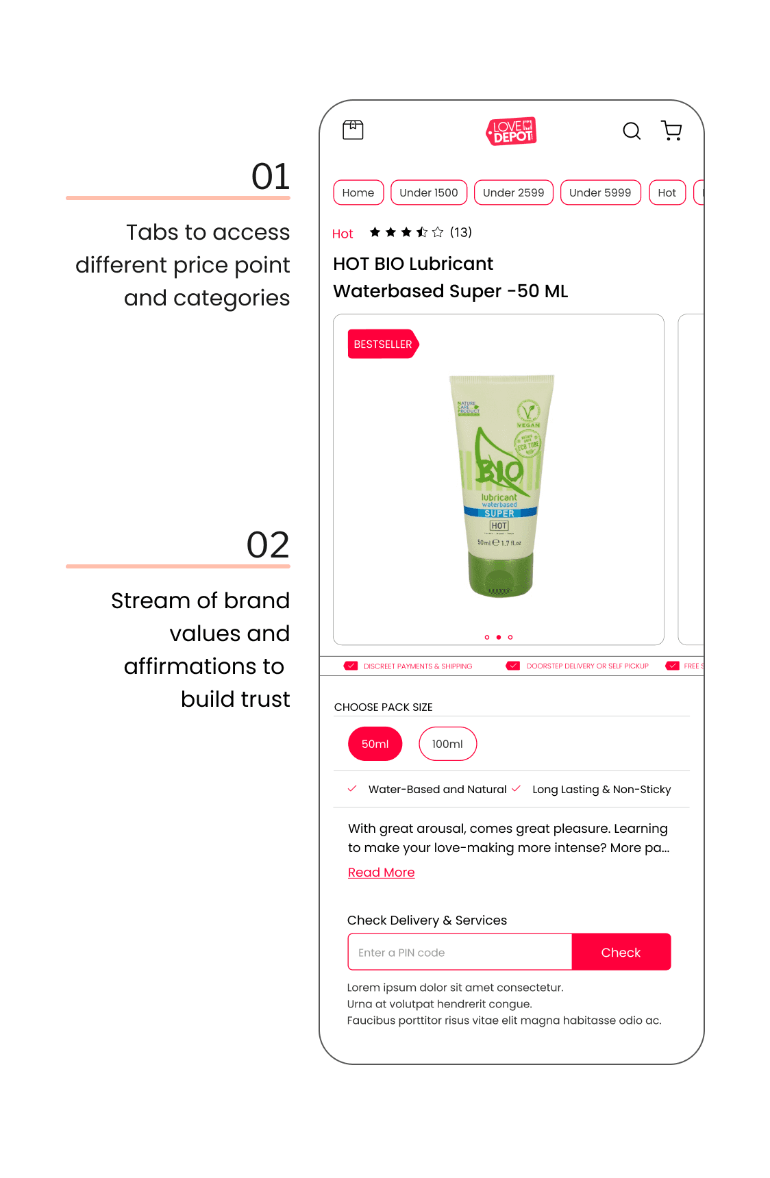
01
02
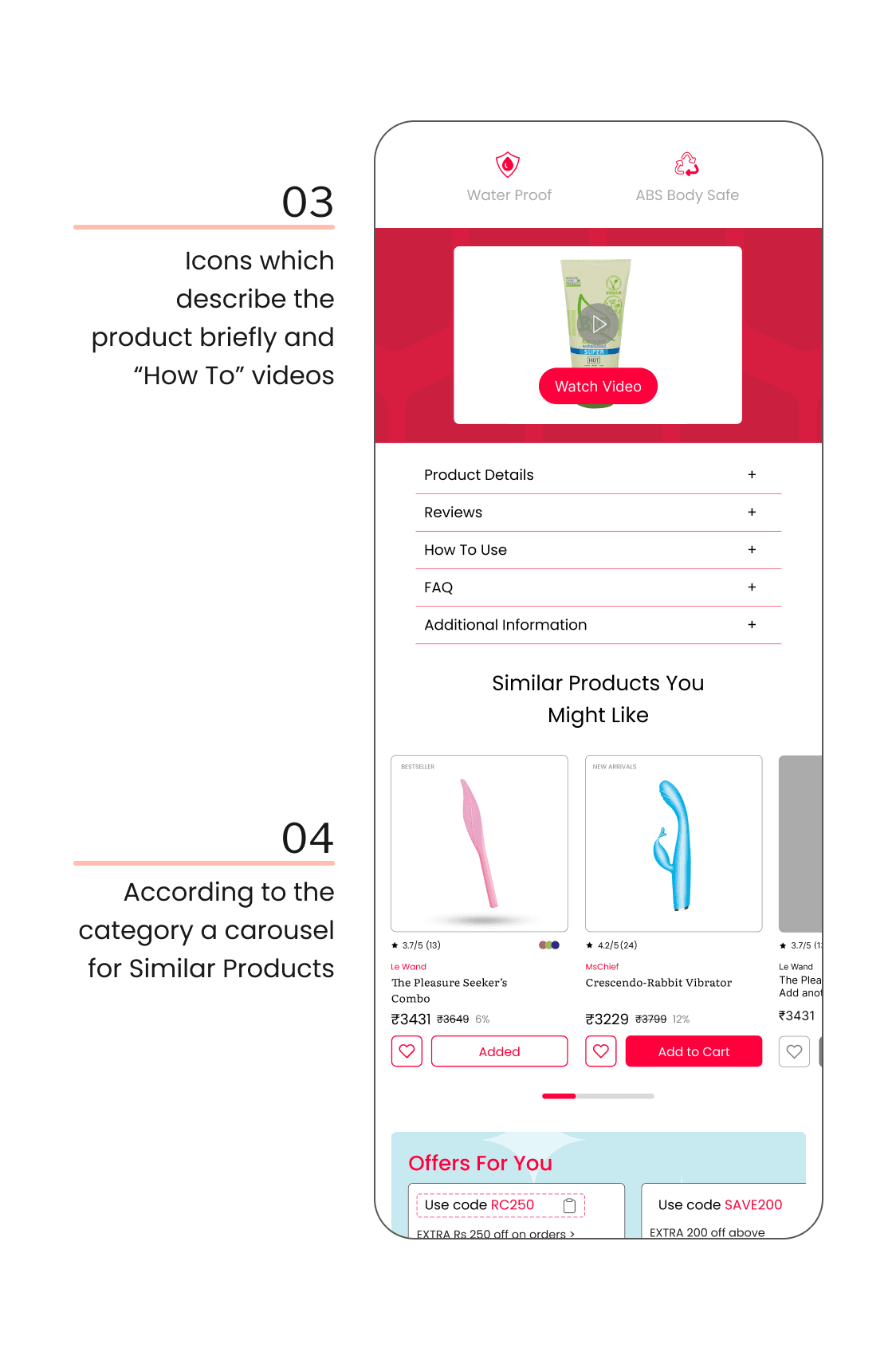
03
LOOKING AHEAD
Following the redesign, the brand saw dramatic improvements in key metrics: session conversion rates increased nearly 8x from 0.38% to 3%, while user engagement grew by 68%. These numbers validated that the brand refresh successfully resonated with users.
Project Learnings
Having a stakeholder with a crystal-clear vision of their brand's needs made the design process flow naturally. This clarity helped us lock in designs efficiently and effectively.
Seamless Integration — The development phase was remarkably smooth - seeing the designs translate from Figma to the live site with such precision was a memorable first. The final result matched our vision perfectly.
Having a stakeholder with a crystal-clear vision of their brand's needs made the design process flow naturally. This clarity helped us lock in designs efficiently and effectively.
